Sunday, November 28, 2010
Poster design
As I mentioned in the previous post, finding the old illustration was quite handy as I ended up basing my entry for a poster design exhibition on it. The designs are going to be screen-printed and we were only allowed to use one color (which was chosen for us) so converting my illustration took a bit of work.
I ended up simplifying it a bit and then using texture and pattern to create layers and delineate areas of space. It was a good challenge to work on, and there are definitely some nice areas of the picture which I wouldn't have come up with otherwise. I think it would be interesting to now use this as a base and add in a few more colors again to see what happens. But I don't know if I'll bother with that :)
Thursday, November 25, 2010
Unearthed illustration
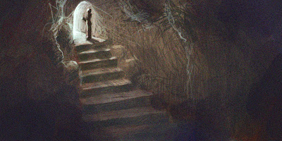
I was looking through some old files trying to find something when I stumbled upon this illustration which I had done in proparation for a music-based animation (which I never ended up doing).
The colors and illustration style quite appeal to me, and I was a bit surprised to see it, because I don't think I could do something like it at the moment!! I guess I was more immersed in illustrative stuff at the time. I like the simplicity and the types of shapes.
I was looking for a different file to use in whipping up a quick poster design for a sort-of-competition but I ended up adapting this illustration instead, as I decided I'm quite fond of it.
Monday, November 22, 2010
Color scheme analysis
I was browsing a website and saw this great stock photo that had a really nice orange/blue color scheme. This is a very common scheme, and when you start looking for it in design stuff it pops up all the time. And for good reason, because the colors really pop against each other and I think it allows a very saturated, colorful image that doesn't feel overwhelming, because the compliments keep each other slightly in check.
Or something like that.
So i did a color study of the photo. I was thinking about doing a different image and just applying the color scheme but I'm glad I didn't because I think I learnt some stuff about how to achieve the look that I probably wouldn't have, if I just tried to make it up myself.
Tuesday, November 9, 2010
Color value study
Like the previous exercises but I tried a color picture. Worked ok, you can see the value analysis in the corners (my painting is the left, photo on the right). The main difference seems to be that I don't push the darks enough in some bits, particularly the shaded half of his face. I knew this was an area I need to work on, but again, mostly quite accurate which is good.
Monday, November 8, 2010
Practicing values
One thing that's crucial to realistic painting, and just good images that pop, is a good grasp of values - being able to capture areas of light and dark properly. On a very basic level it's not too hard, but as soon as I start dealing with shadows (which are, of course, everywhere!) I lose it a bit - it's really important to really see what is there, not just what you think you see...
So I did a few practice paintings, just trying to get correct range and contrast throughout an image. I blurred each one after I finished so I didn't get distracted by the unfinished, blotchy strokes, and I could look only at the overall accuracy. I think I did ok. In the last one, I took my painting and the original photo and applied a Gradient Map which basically colorises the picture based on brightness. And mine ended up fairly accurate, which makes me happy :)
Next I'll have to try using some color, because hue/saturation/value together is what's really tricky!
Thursday, November 4, 2010
First acrylic painting
In an attempt to kickstart this whole 'artist' thing, which I temporarily suspended because I wasn't sure if I really wanted to do it (and still don't know), I have finally bought a few acrylic paints and decided to do some stuff with them.
I wanted to find something I could just copy, a still life of sorts, so that I could just focus on playing with the paint and learning how they work, mix etc. I painted on some crappy old paper that I had lying around. It turned out ok, it's pretty difficult, but I enjoyed it. I realised that all the digital painting I've done has been good for helping me understand color, saturation etc, but that the difficulties I have there are still translated across, as WELL as having to mix my own colors, and work with the medium.
Don't know how i'm supposed to get really dark values, I think black paint deadens everything but mixing my own didn't seem to work, so I'll read up on that. Good dark/lights is always something I need to pay attention to anyway.
But for now I'm trying to just enjoy it and keep myself actually working at it.
Subscribe to:
Posts (Atom)